01 / Banking safety shield
Service design · Product strategy · Core UX
A shield for moments that can’t wait.
A protective layer that lets customers secure their financial life immediately—even when they don’t yet know whether to freeze a card, close an account, or lock everything.
Real project thinkingDetails anonymized
Protection statusShield is on.
No one—including you—can move money until you’re ready.
The challenge
Offer decisive protection without teaching fraudsters how every security control works.
My role
Senior product designer across problem framing, service model, interaction architecture, wireflows, and interface design.
Design outcome
A two-route protection model translated into five connected flows, 27 mobile screens, and 18 reusable component families.
Current experience / Before
Protection existed. Finding it was the customer’s problem.
Each incident led to a different product, channel, or operational path. A customer had to correctly diagnose the risk before reaching the right control.
Customer feels unsafe“What do I need to stop?”
Lost cardCard settings
Stolen phoneCall center
Unknown paymentTransaction detail
Account riskSecurity settings
Unclear incidentNo clear route
Design premise
When people feel unsafe, the first need is not product diagnosis—it is a fast, understandable route to a protected state.
Illustrative crisis journey
A stressful moment, mapped minute by minute.
A composite scenario used to stress-test the experience from uncertainty to a visible safe state.
00:00Sees unexpected activity
“Is money still moving?”
00:02Cannot identify the source
Card, phone, and account all feel at risk.
00:05Searches for a control
Fragmented settings increase uncertainty.
00:12Requests help
The journey moves to a bank-controlled channel.
00:18Reaches a protected state
Paused actions and next steps become visible.
Low anxietyHigh anxiety
Banks optimize for engagement. Safety sometimes asks for the opposite.
Banking products are designed to keep customers active: buy, transact, increase limits, and add products. Protective actions such as lowering limits, freezing cards, or closing access are often harder to find. That commercial logic becomes dangerous when someone is already in a moment of uncertainty.
01
Panic is not a flow
In a stressful moment, customers cannot diagnose banking products, risks, and operational rules.
02
Protection is fragmented
A lost card, suspicious transfer, stolen phone, and compromised account lead to different controls.
03
Transparency has limits
Explaining every security mechanism can reveal useful information to fraudsters.
Design question
How might we protect first, ask only what matters, and guide customers without exposing the bank’s defenses?
Two ways in. One protective system underneath.
Customers can enter through a specific incident or activate a general shield when they cannot identify the problem. Both routes prioritize immediate containment before diagnosis and recovery.
Route A · I know what happened
Incident-based help
“My card is lost.”
“My phone was stolen.”
“I don’t recognize this payment.”
or
Route B · I only feel unsafe
Activate the shield
Pause cards, accounts, money movement, and app access through one decisive action.
Protect everything →Primary user flow
Protect first. Diagnose second.
The system supports customers who know exactly what happened—and those who only know they feel unsafe.
EntrySomething happened?
↓DecisionDo you know what happened?
Yes
Route AChoose incident
Targeted controls
No / Not sure
Route BActivate Shield
Broad containment
Shared routeVerified recovery
Review → verify → restore safely
Incident taxonomy
Customer language on top. Protective systems underneath.
The front stage stays understandable while sensitive security logic remains abstract.
What the customer says
My card is lost or stolenMy phone is lost or stolenI don’t recognize a transactionMy credentials may be compromisedI’m under pressure or in dangerI don’t know, but I feel unsafeWhat the system can protect
Card controlsAccount controlsMoney-movement controlsDevice and session controlsIdentity verificationGuided recoveryAnonymization boundary
The portfolio shows customer-facing categories while deliberately abstracting security rules, triggers, and operational thresholds.
Design evolution
Show the decisions, not only the final answer.
Three interaction models were compared against urgency, customer effort, clarity, and the need to protect sensitive security logic.
Shield
Selected product story · 9 of 27 screens
The moments that prove the system.
The full product covers five connected flows. For the case study, one main route, one distinctive risk scenario, and one clear ending show the thinking without turning the page into a screen dump.
01 Universal protection02 Live-call verification03 Safe recovery
01 / Main product spine
From “something feels wrong” to a visible safe state.
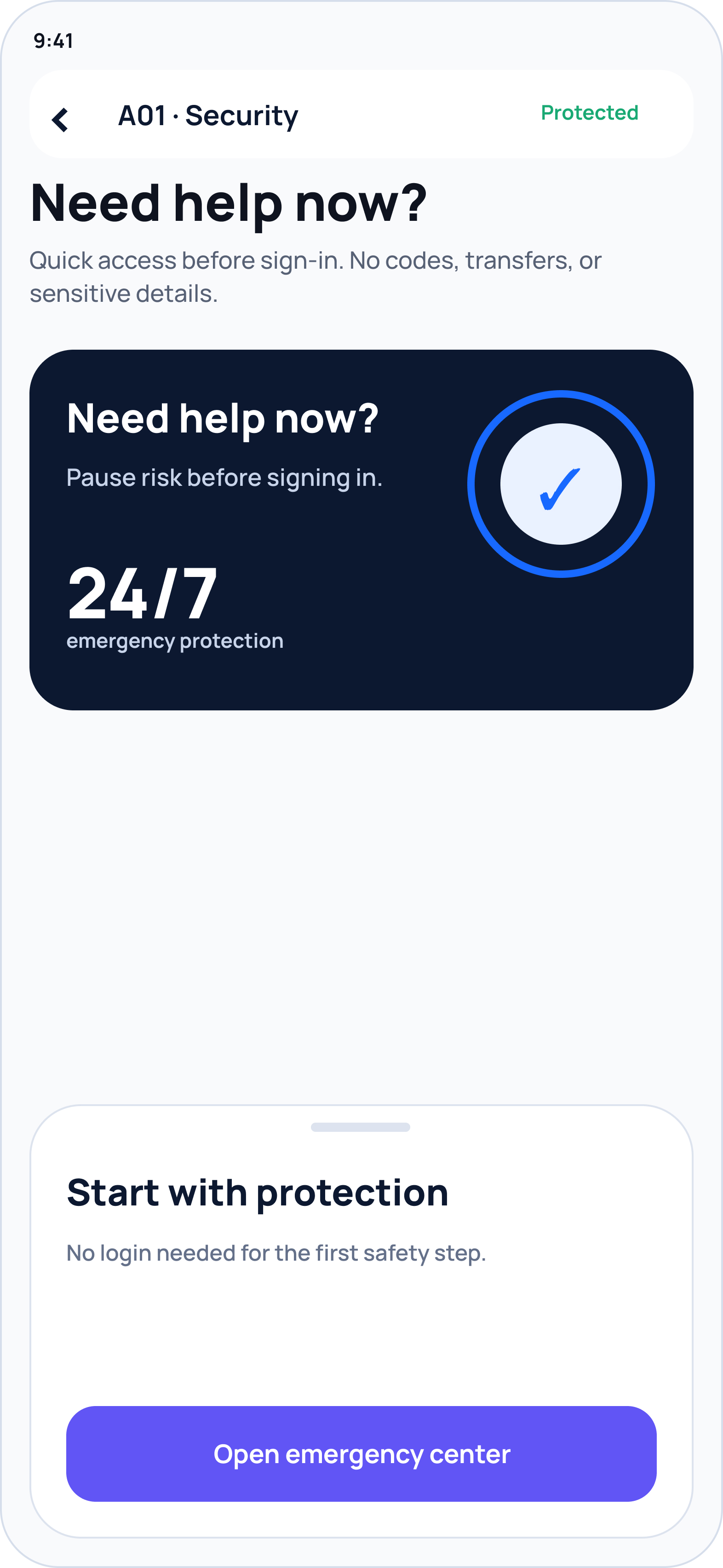
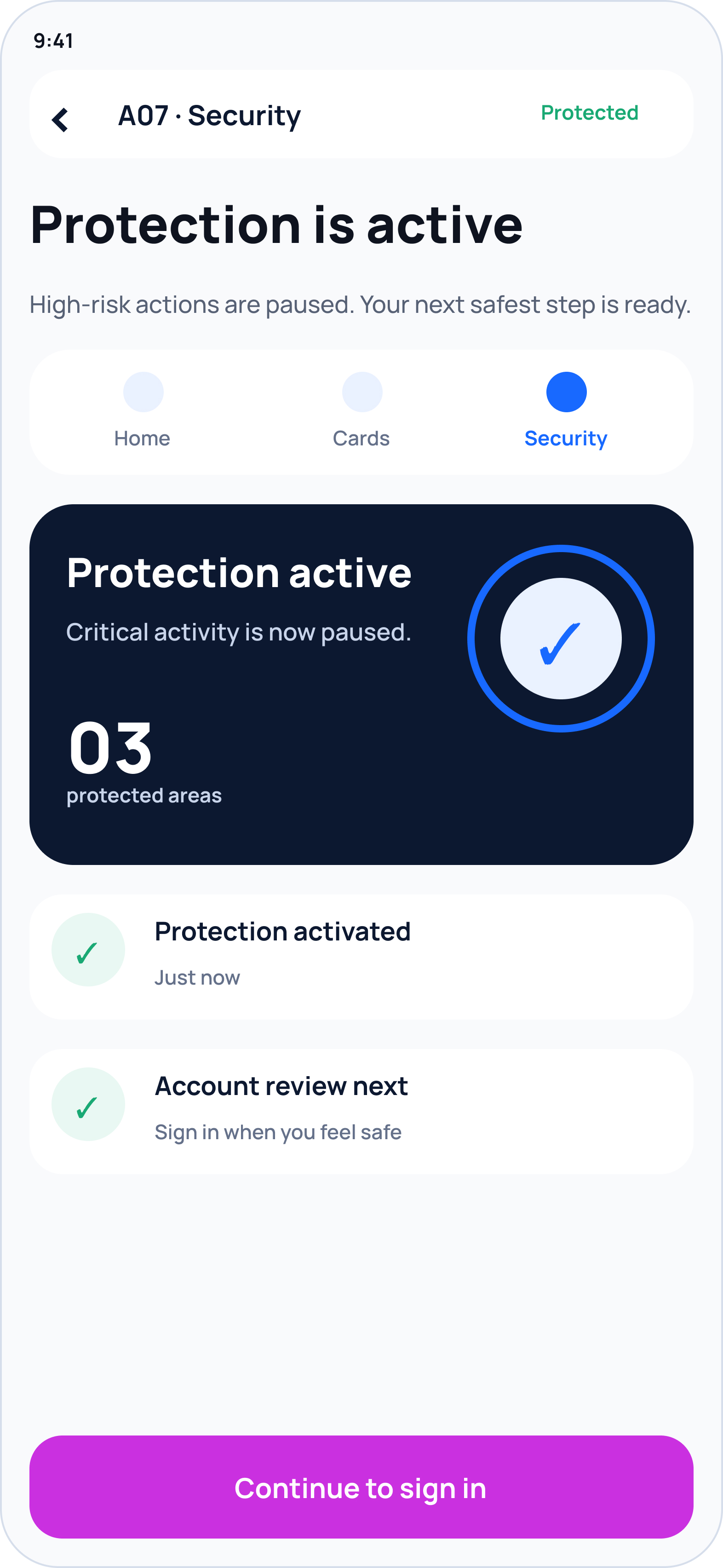
Five screens show the core UX logic: enter quickly, describe the situation in plain language, accept a system recommendation, understand its impact, and reach safety.
Safety is reachable before normal access.
The customer does not need to navigate the banking product—or even sign in normally—to ask for help.
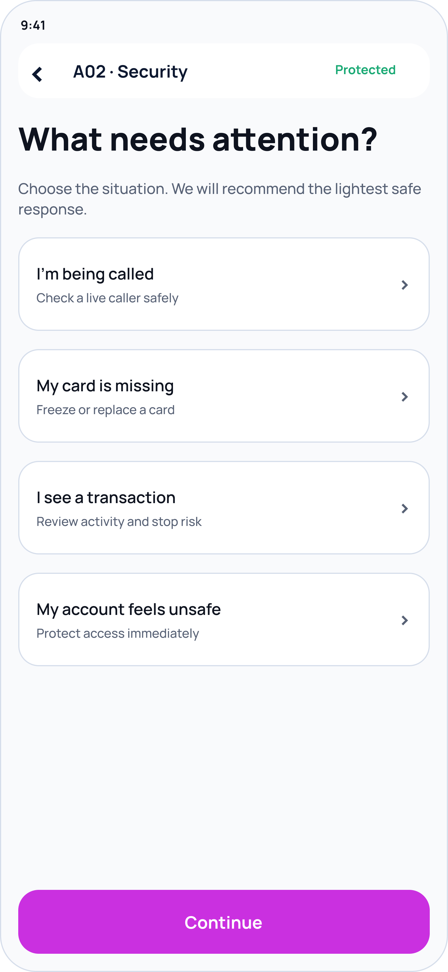
Customer language replaces product architecture.
The first question describes lived events, not cards, accounts, sessions, or fraud operations.
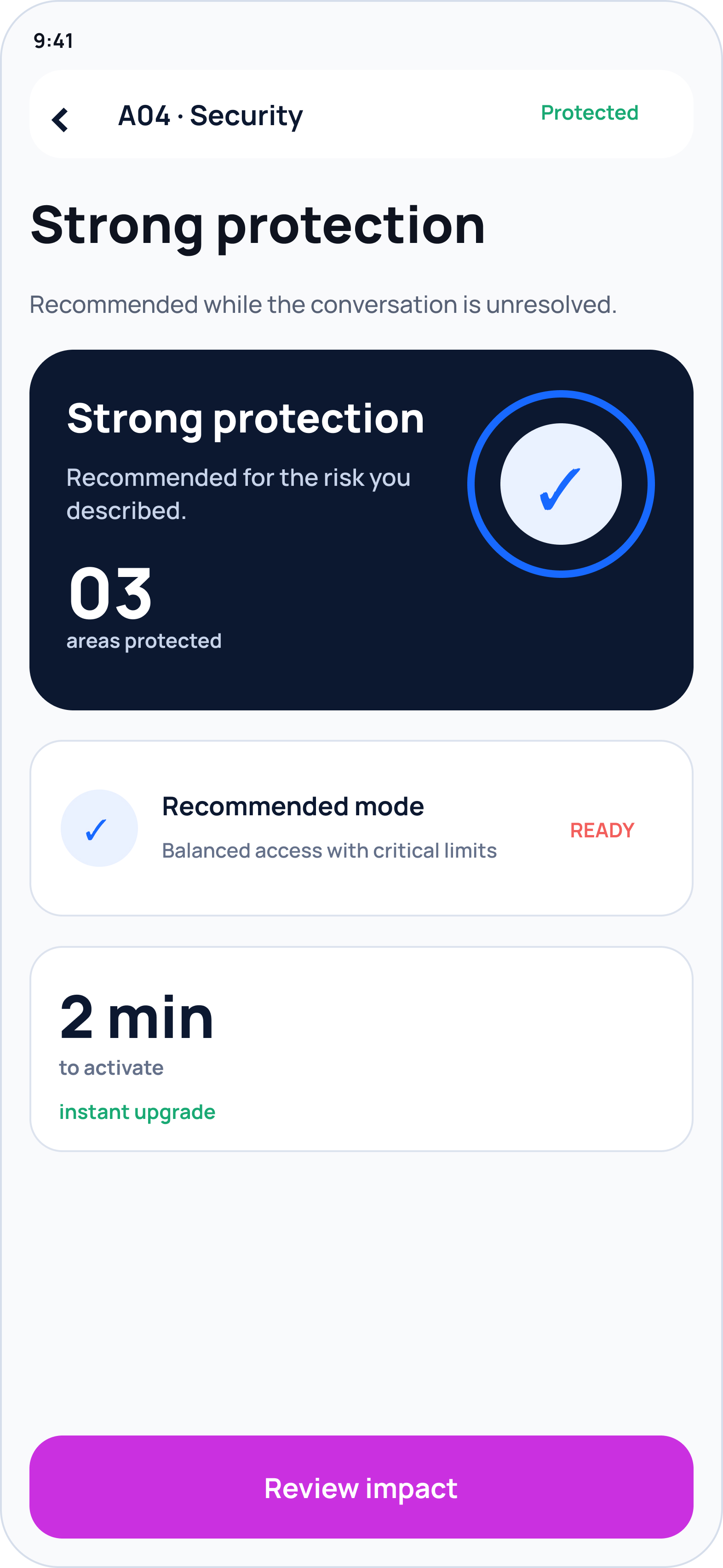
The system proposes the safest proportionate action.
Customers do not have to guess which controls match the incident while under pressure.
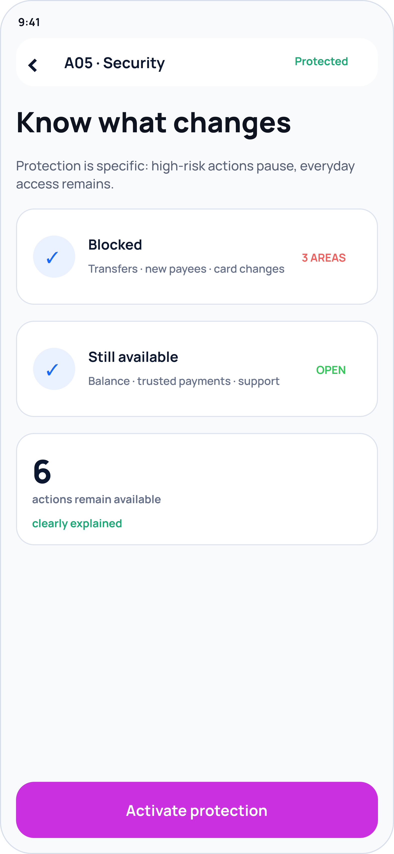
Blocked and available actions are equally explicit.
Before confirming, the customer sees both the protection boundary and what remains usable.
A clear state replaces uncertainty.
The experience confirms what is protected now and gives the next safe action.
02 / Distinctive scenario
Verify the call without trusting the caller.
This branch makes the case specific to modern banking risk. It contains the customer first, produces a clear verification result, then moves the conversation to a bank-controlled channel.
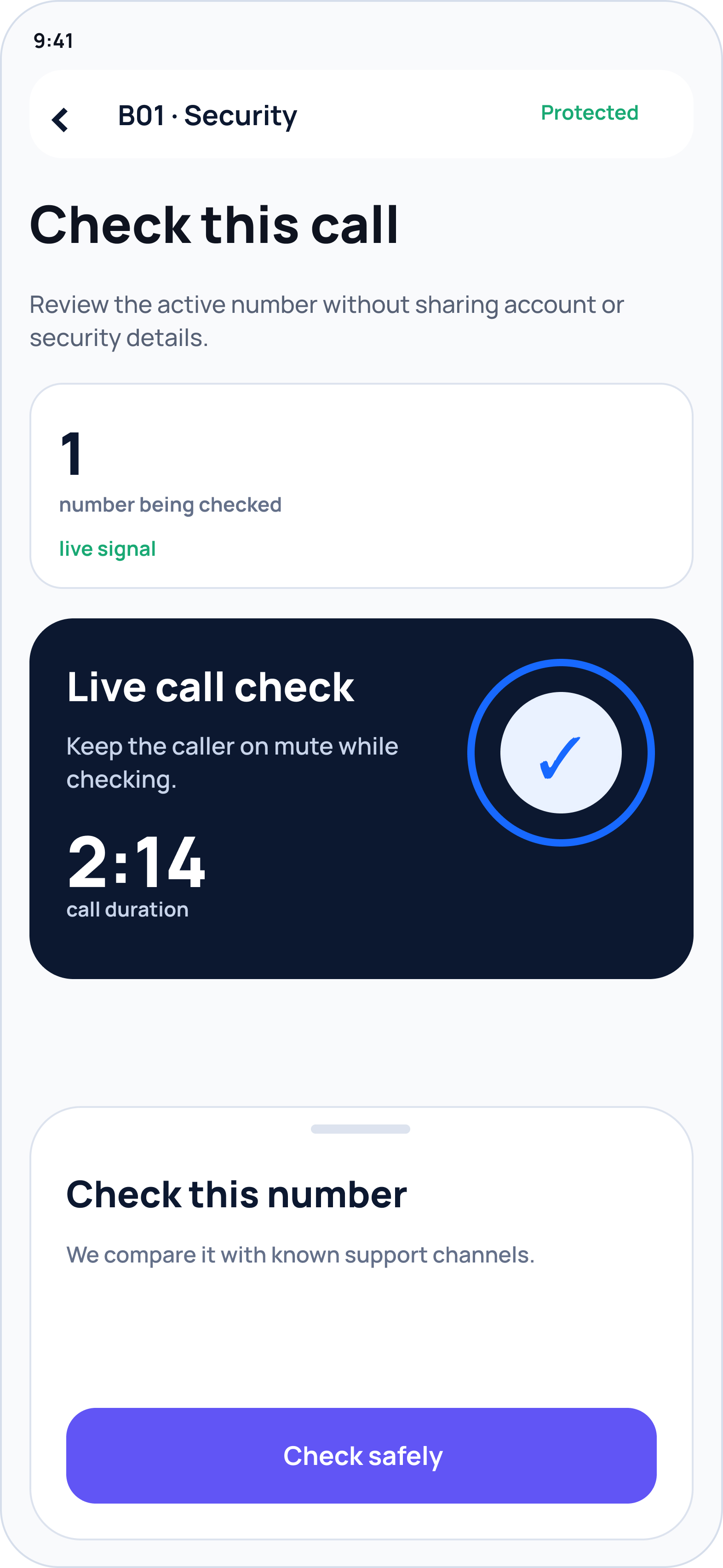
Check a caller without continuing the risky conversation.
The app becomes the trusted surface while protection stays active.
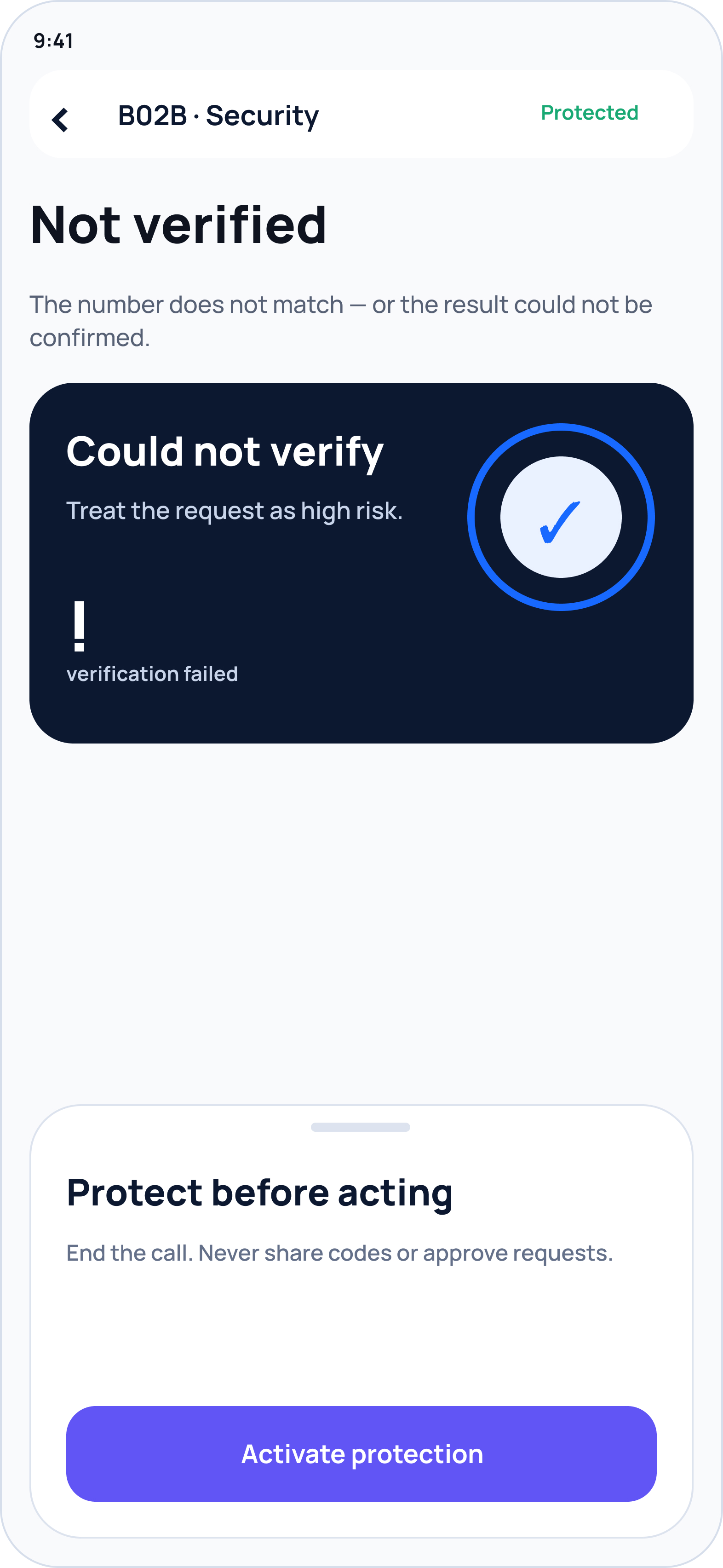
Uncertainty defaults to safer behavior.
The result avoids overclaiming, explains the immediate action, and does not expose detection logic.
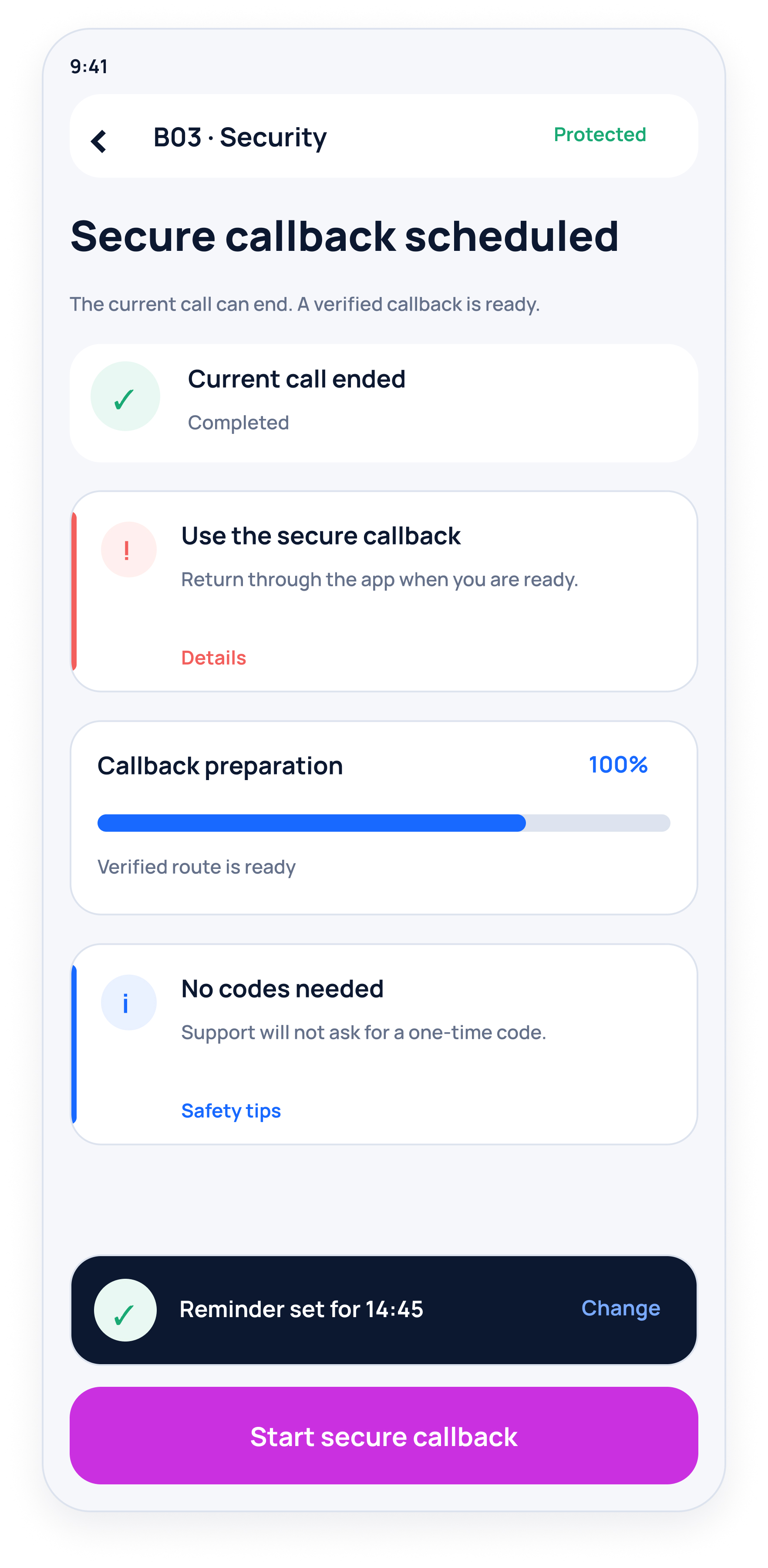
The bank closes the unsafe channel.
A verified callback removes the pressure to decide whether the person on the line is legitimate.
03 / Recovery closure
End with evidence—not a vague success message.
The final screen shows what happened during protection, confirms that checks are complete, and makes restored access legible. That closure is essential to trust: the customer knows the crisis has actually ended.
5 connected product flows27 designed mobile screens18 reusable component families
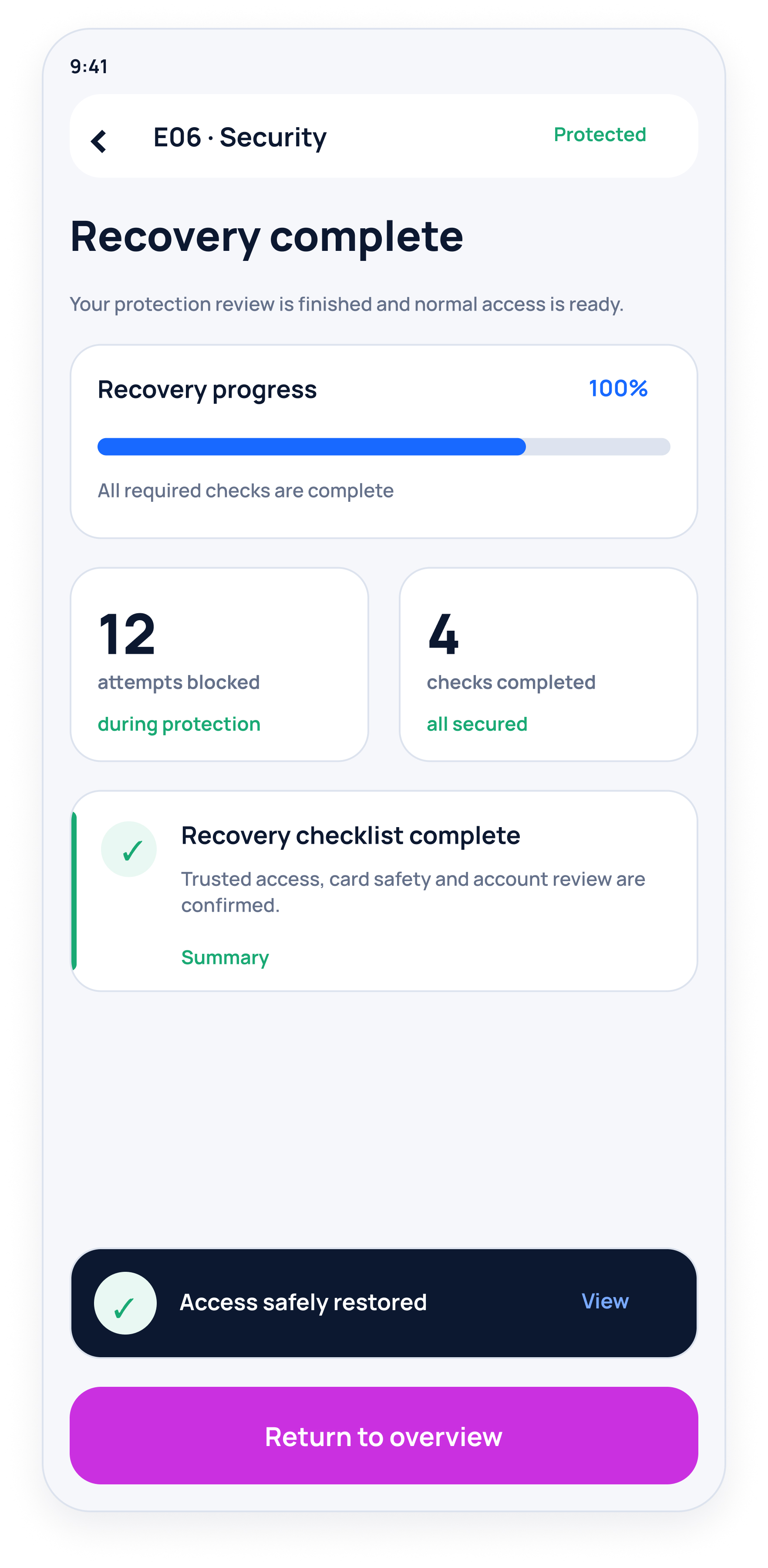
Protection ends with a reviewable record.
System breadth
The wider prototype also covers lost or stolen card, suspicious transactions, and ongoing protection management. They remain supporting branches; the selected story above carries the portfolio narrative.
Edge-case matrix
Safety design lives in the exceptions.
Critical scenarios are considered before the happy path is treated as complete.
ScenarioImmediate responseRecovery consideration
Shield activated by mistakeKeep the protected state reversibleStep-up verification before restoration
Customer has no phone accessMove to an authenticated alternative channelAssisted identity recovery
Customer is under coercionOffer discreet containmentSafe-time and safe-channel checks
Transfer already in progressPause or flag where possibleRoute exceptions to operational review
Joint account is affectedExplain product-level scopeProtect other-holder rights and access
Verification failsMaintain the protective stateEscalate to assisted recovery
Service blueprint
One reassuring moment on the surface. Many systems coordinating below.
CustomerFeels unsafeChooses routeActivates protectionReviews incidentRecovers access
Front stageEmergency entryIncident guidanceShield statusClear next stepsRecovery UI
Line of visibility
Security layerRisk detectionPolicy evaluationControl orchestrationIdentity verificationControlled restoration
OperationsCase signalPriority routingSpecialist reviewSafe customer contactCase closure
Bank systemsSession controlsCard controlsAccount controlsMoney movementAudit trail
The system is shown at a deliberately abstract level to protect confidential security rules and operational thresholds.
A good safety experience earns trust before it asks for it.
01
Contain before diagnosing
Give customers a safe state before asking them to understand the incident.
02
Be clear, not revealing
Explain what is protected and what happens next without exposing defensive logic.
03
Make protection reversible
A broad lock should lead into a guided, verified recovery—not a dead end.
Proposed success measures
How we would know the shield is working.
Because this concept is not presented with live product data, success is defined through the signals a production team should validate.
↓Time to protection
From emergency entry to a confirmed safe state.
↑Self-service containment
Incidents safely contained without avoidable handoffs.
↑Customer confidence
Comprehension of what is protected and what happens next.
↔Support demand
Monitor demand quality—not only reduction.
My reflection
The hardest design problem was balancing decisive protection with proportional control. A universal shield reduces the customer’s diagnosis burden, but it only earns trust when consequences are explicit and recovery is clear. The work reinforced that safety UX is not a single emergency button; it is a coordinated service state with a careful way back.